Logo design, brand and identity design
Revelwell
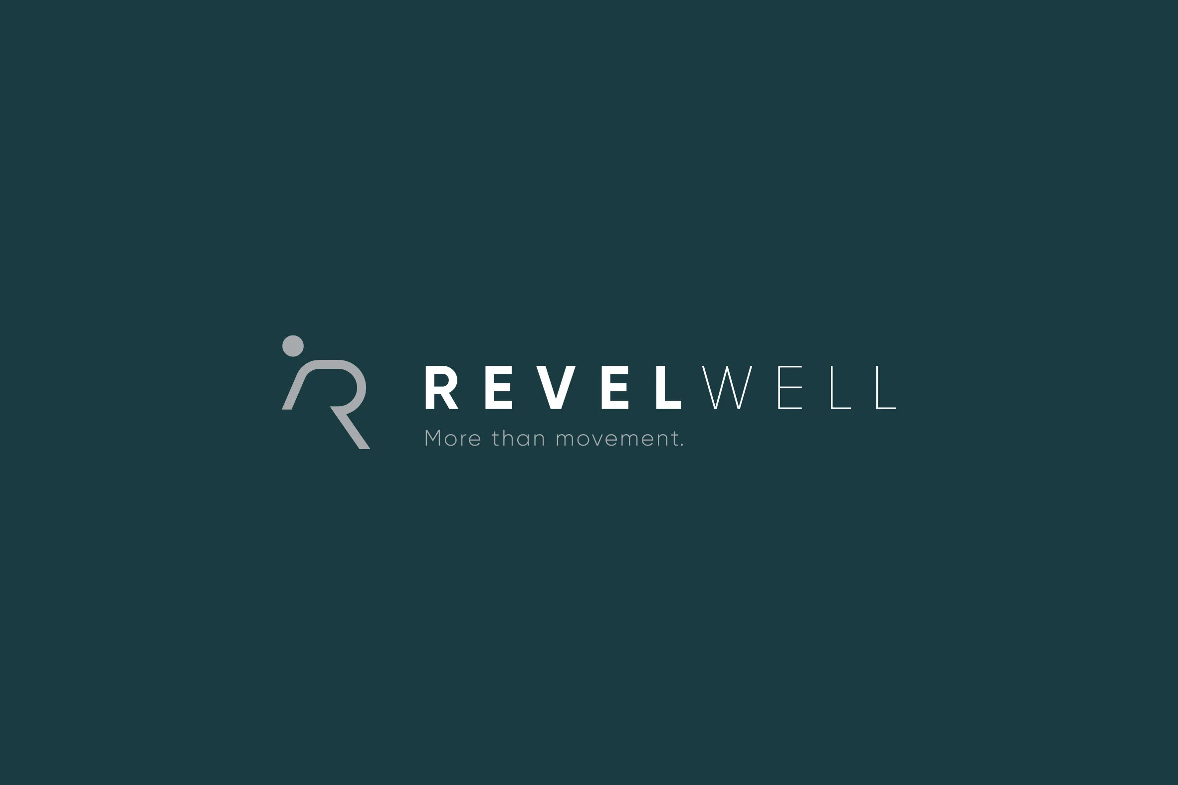
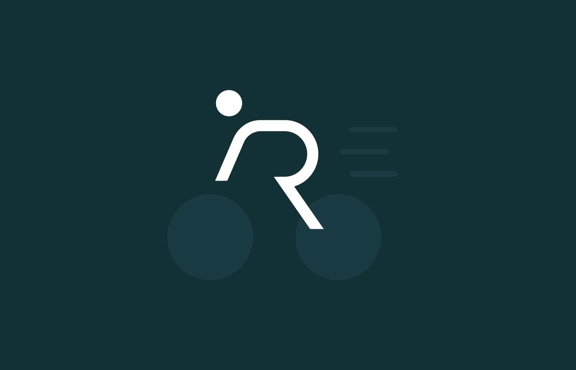
An online fitness and wellbeing service. The R is a figure on a bike: premium yet simple, approachable and clear.

The Work
01 · Context
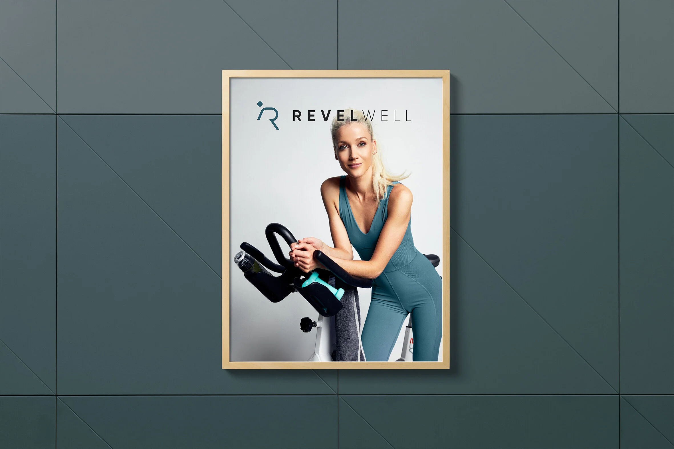
Premium yet simple, approachable and clear.
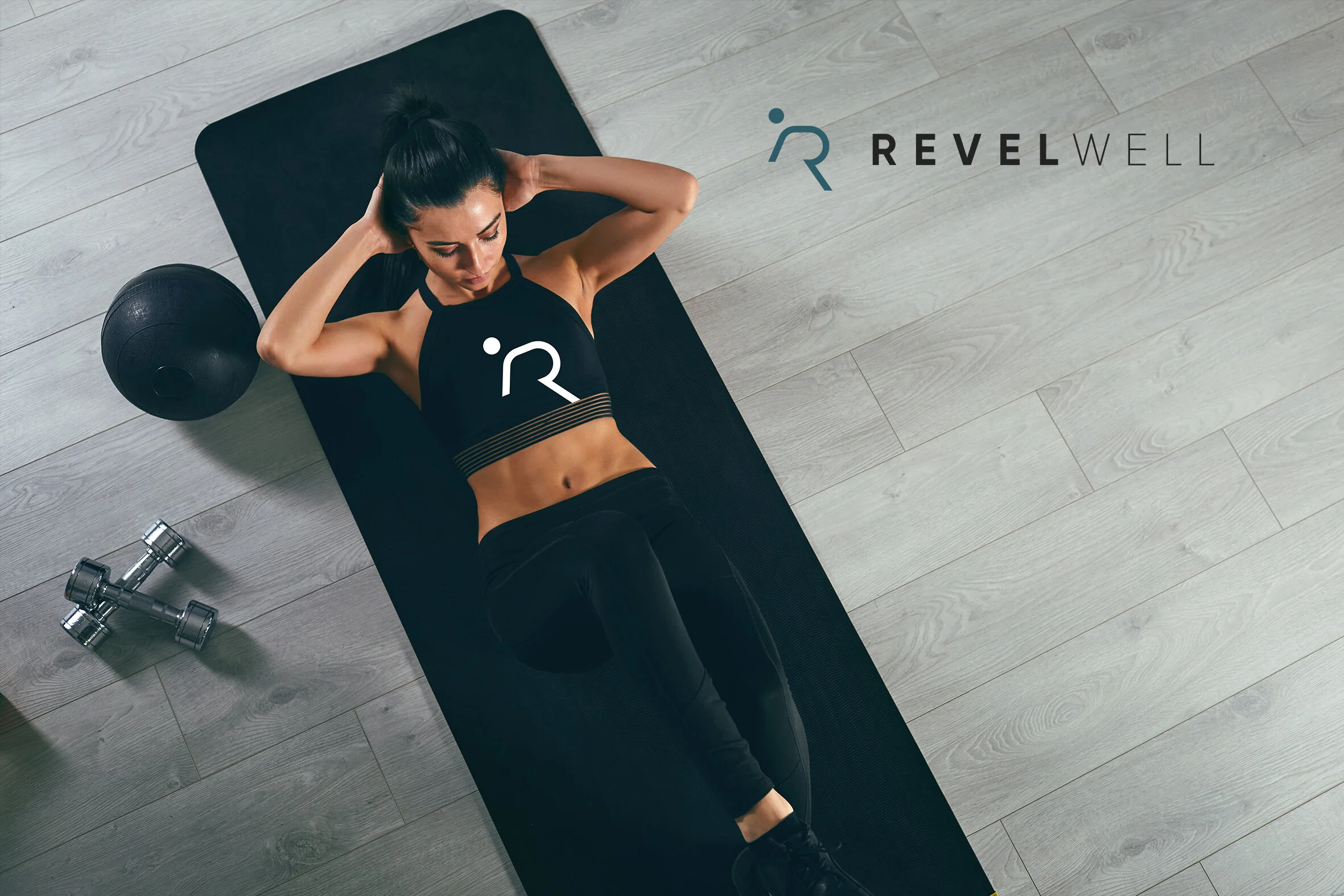
Logo and branding for an online monthly fitness and wellbeing service offering online workouts: Ride, Yoga, Mobility, Pilates and more.
02 · The idea
The R is a figure on a bike.
The client brief requested the brand to be perceived as “visually upbeat, elegant, cool and chic... but very simple to navigate; premium but affordable. Changing the way you ride, which can change your life.”
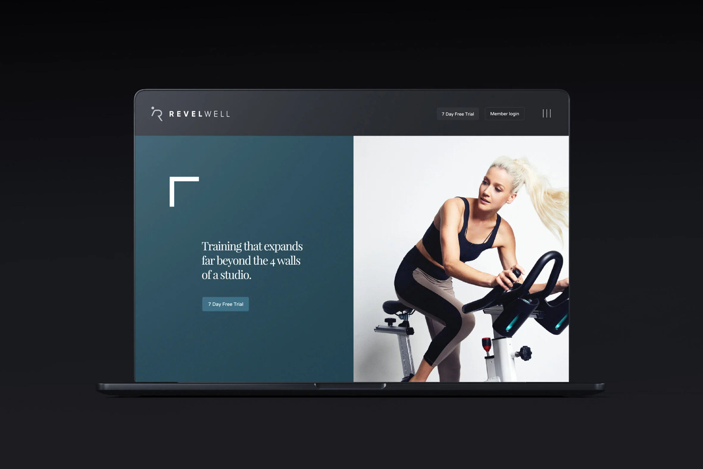
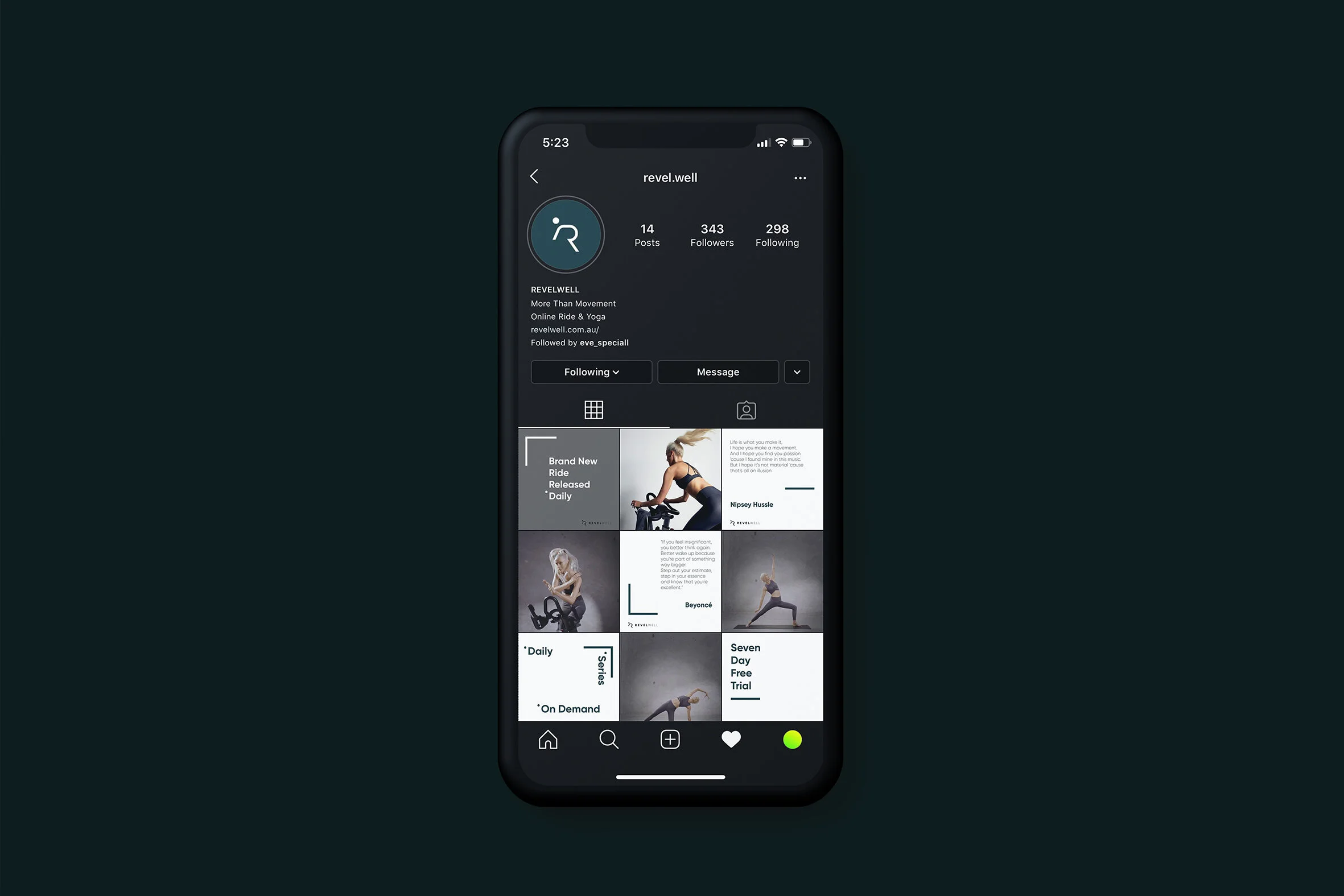
Based on this, I created a logo aesthetic that was premium yet clean and simple, which spoke to the service offering in the logo icon.
Scope
Logo design
Brand & identity design
Client
Eve Speciall & Samuel Aspinall
Founders of Revelwell
Task
Create a brandmark that reflects the name Revelwell. To Revel is to take great pleasure or delight in something; Well refers to wellness, the state of being in good health. The letter “R” is a human figure cycling, which is the core of the business offering.
Related projects
Where to next?
FEELING THIS?
Let’s make your next move count.
Have a brand to build, a website to rethink or an idea that needs shaping? Tell me where you’re at and we’ll work out what comes next.